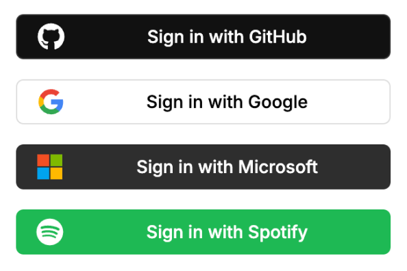
Renders all the <OAuthButton />s enabled for your Neon Auth project.
note
If there are no OAuth providers enabled, this component will be empty.
Props
type:'sign-in' | 'sign-up'— Specifies whether the buttons text are for sign-in or sign-up (both are the same in terms of functionality).
Example
import { OAuthButtonGroup } from '@stackframe/stack';

export default function Page() {
  return (
    <div>
      <h1>Sign In</h1>
      <OAuthButtonGroup type="sign-in" />
    </div>
  );
}